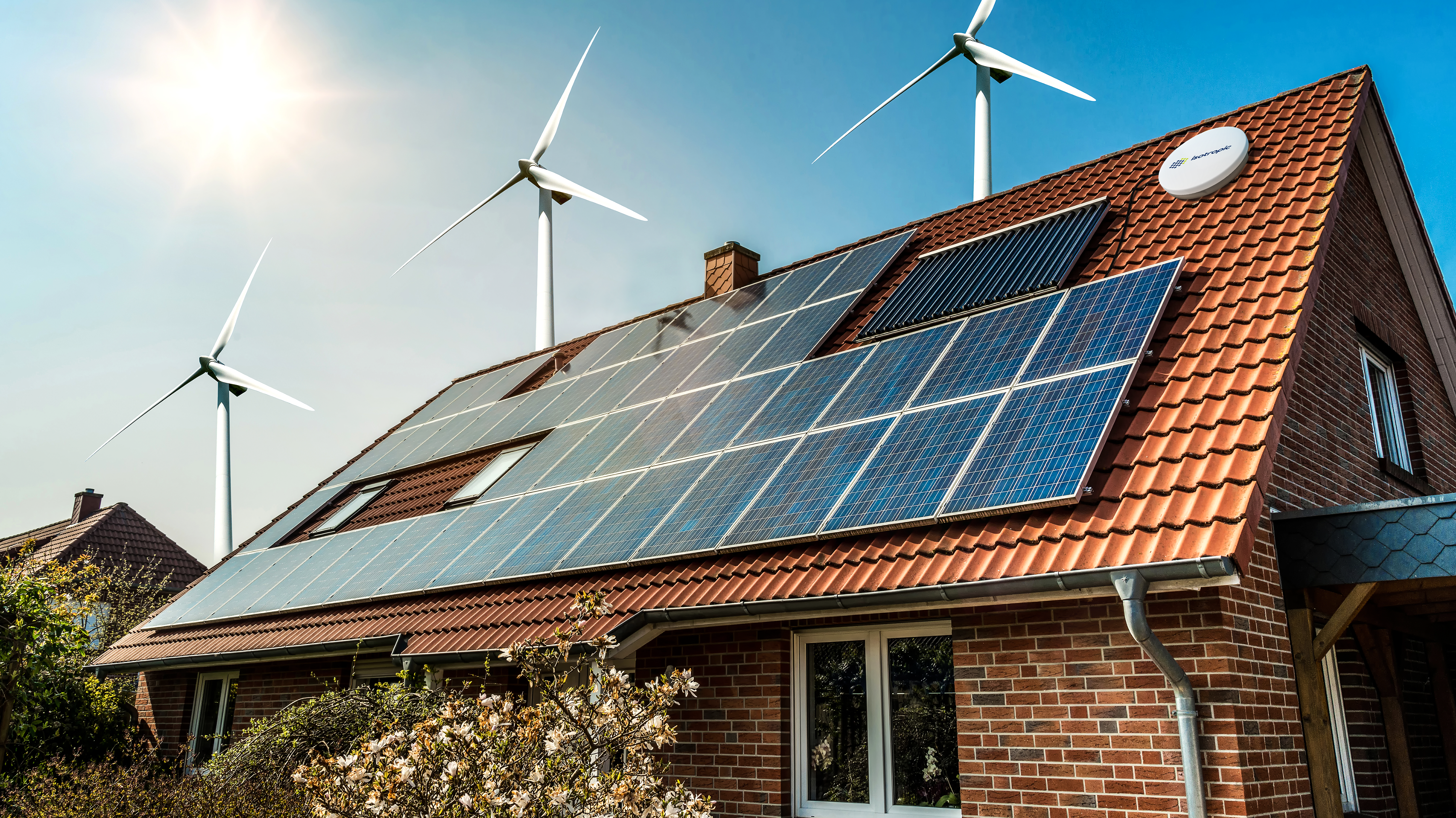
Visual brand language was an early focus of my career. In 2007, I set out to rethink how our design group defined, documented, and evolved Trek’s form language as a repeatable system rather than a series of one-off products. The images that follow illustrate an early form-development framework that unified Trek’s product family under a single, cohesive design vision while still allowing for category-specific expression. The work started nearly two decades ago still echoes in Trek's design philosophy today.

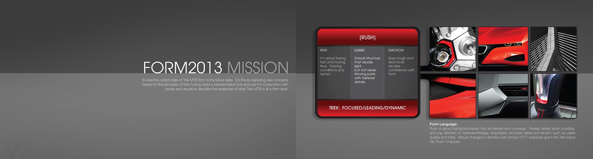
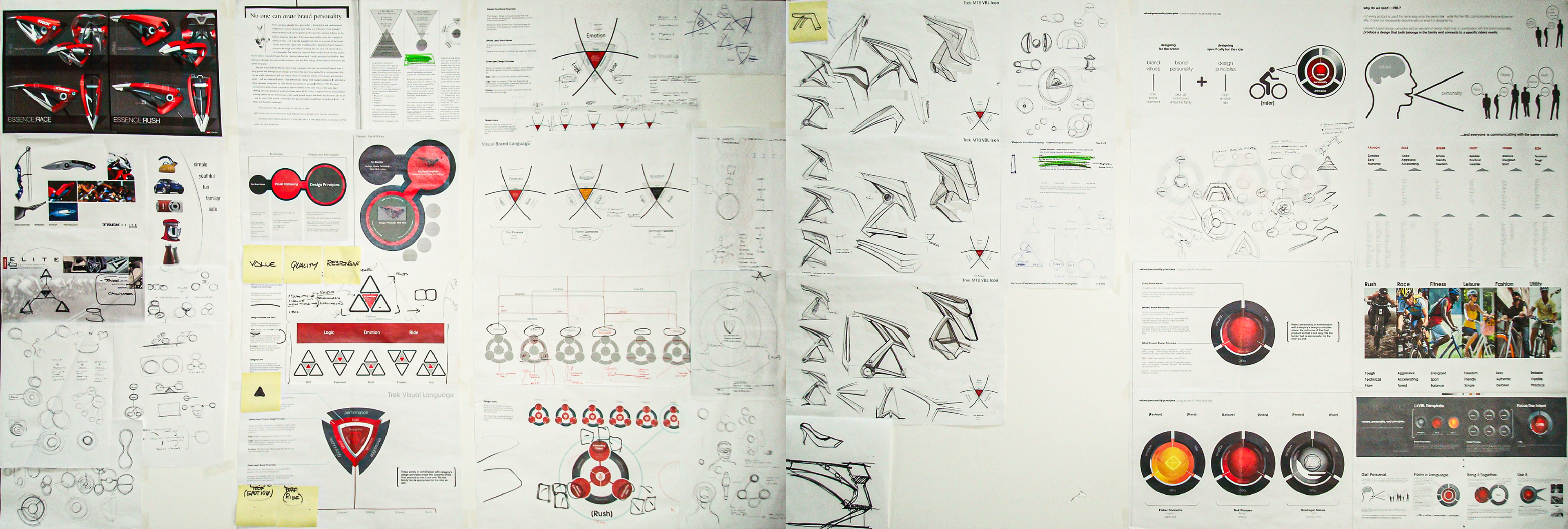
The challenge for designers is 1. establishing a new or updated VBL, and 2. maintaining VBL consistency throughout a product line, and 3. knowing which direction to push as a product may be used by a specific customer or use case. Form is visual. Visuals are driven by emotions that we can put words to. But images and words are not enough, this needs to be translated into something tangible that represents the VBL - and that's where this started.
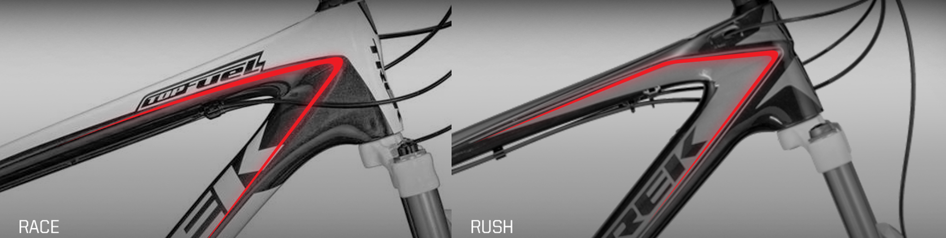
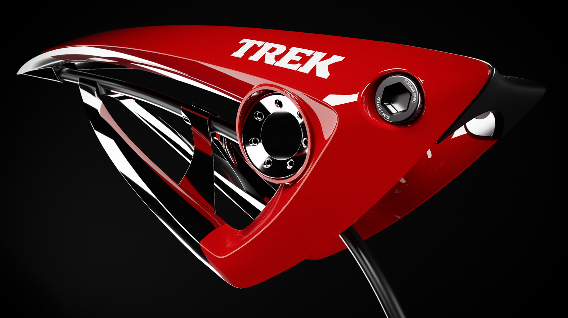
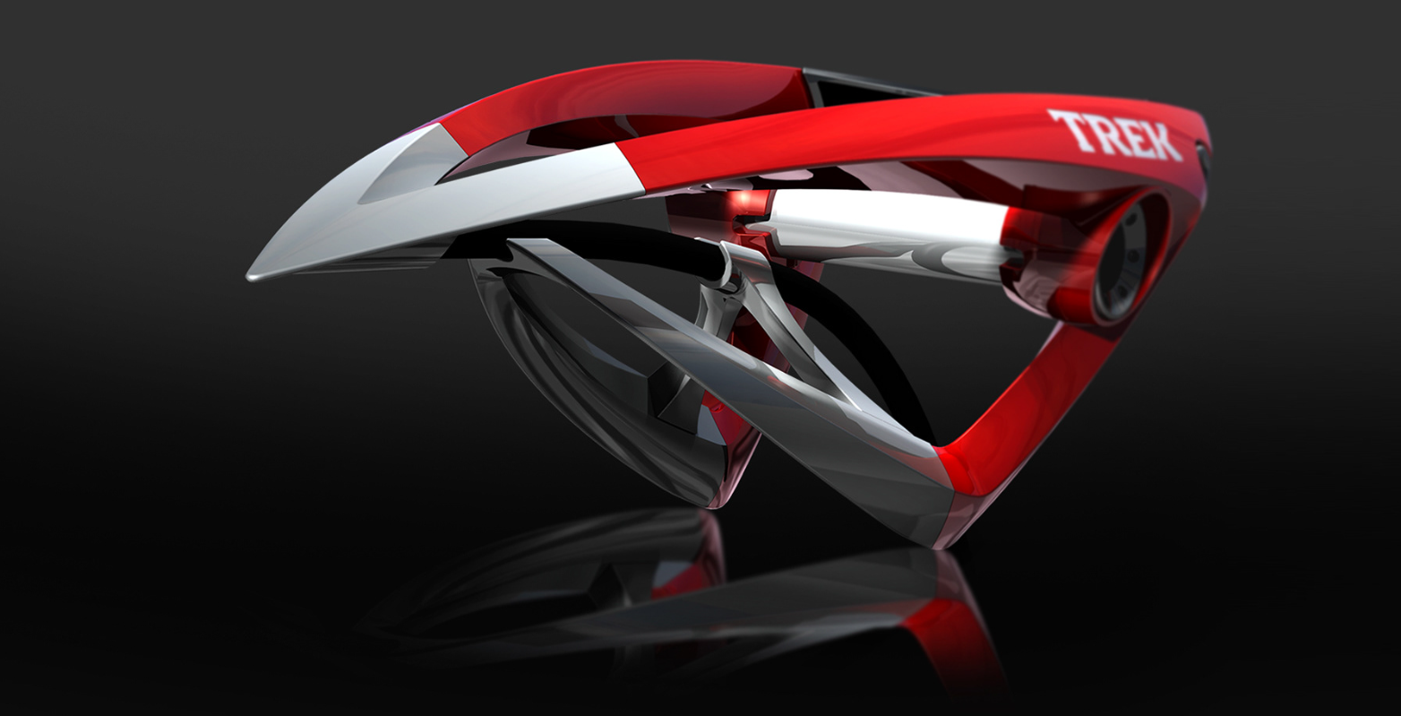
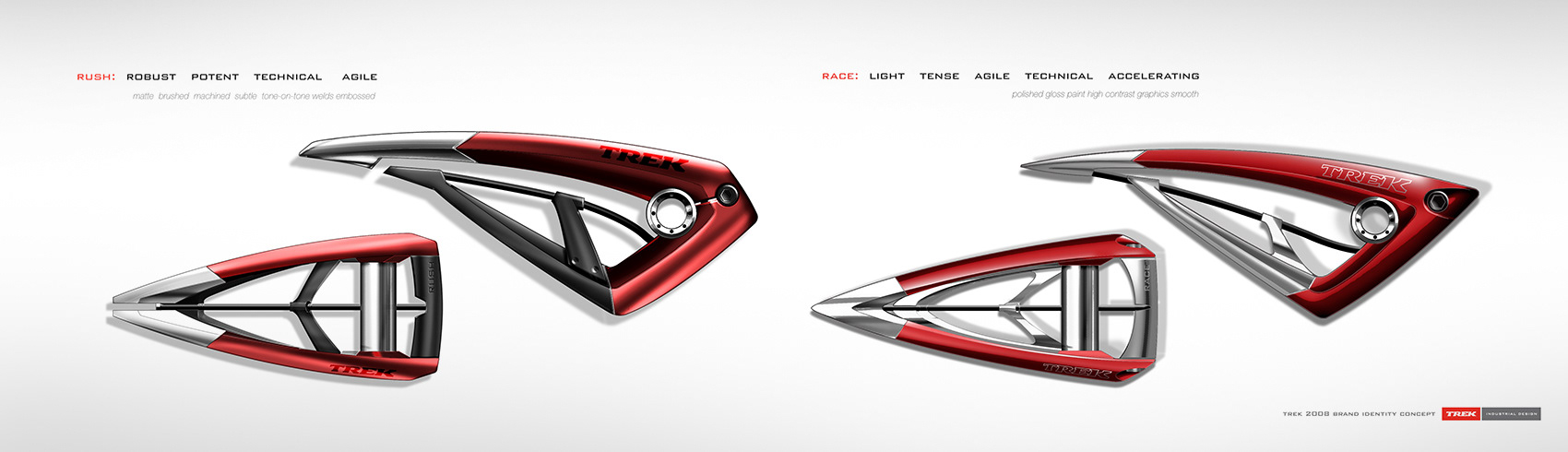
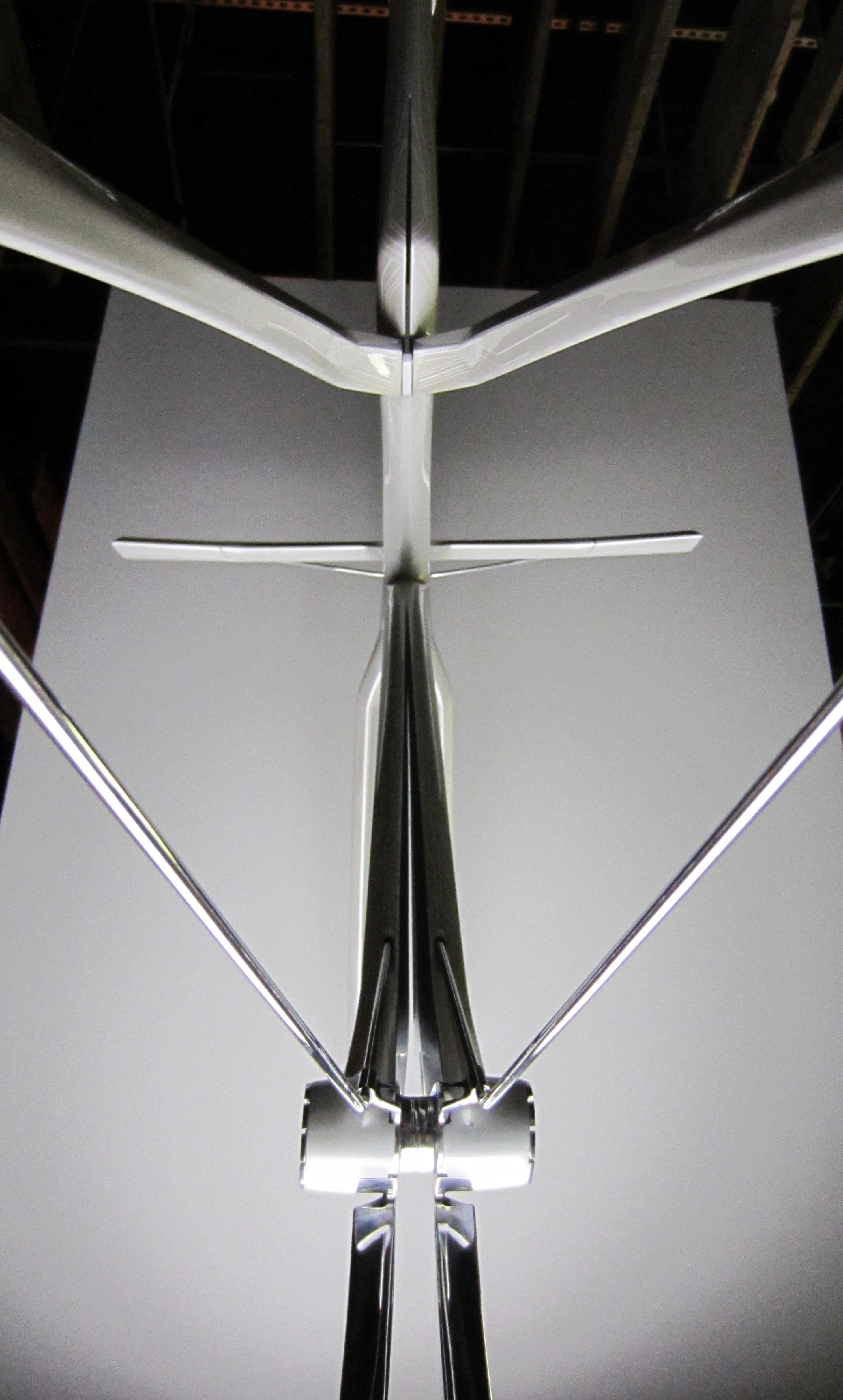
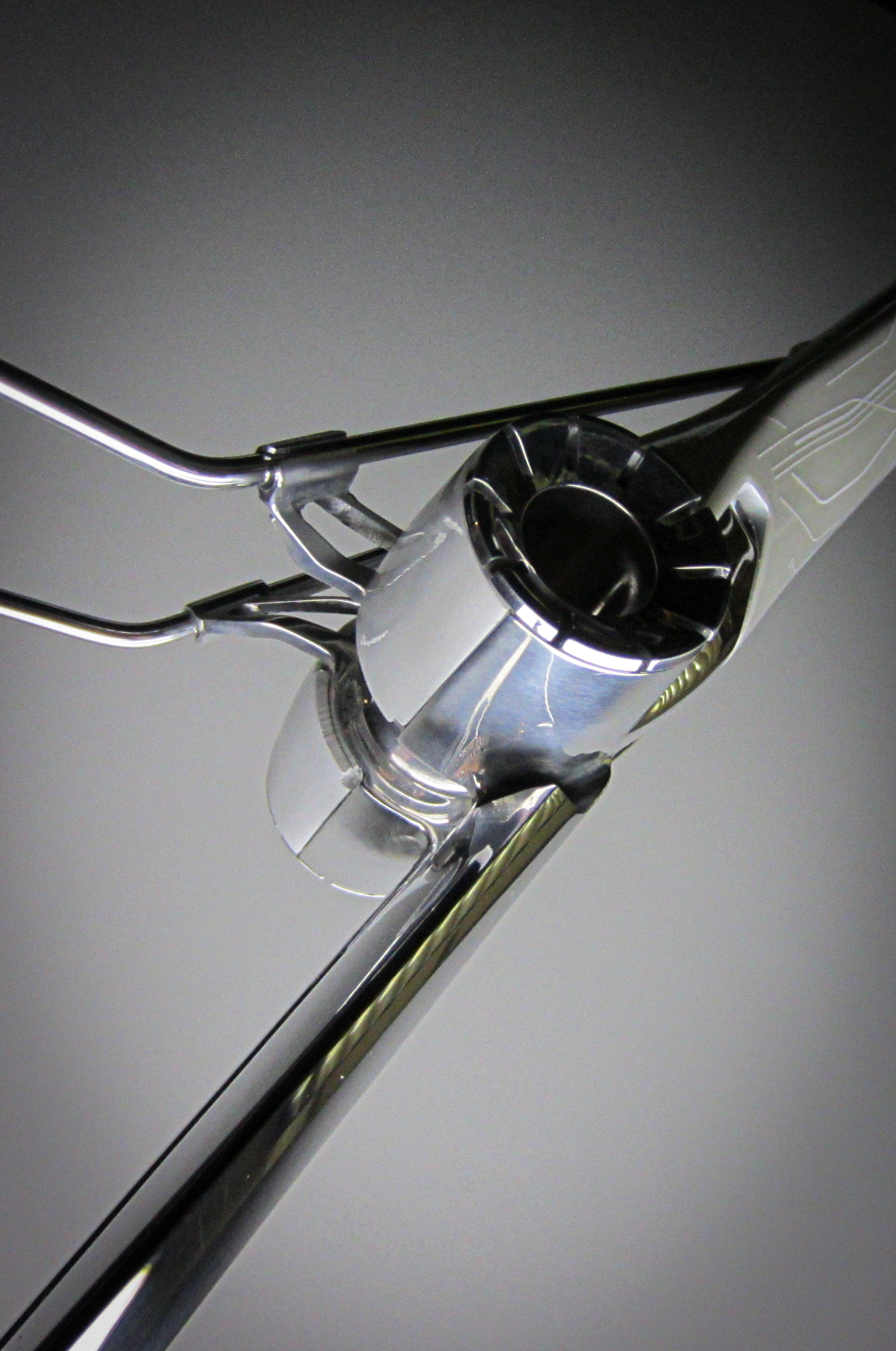
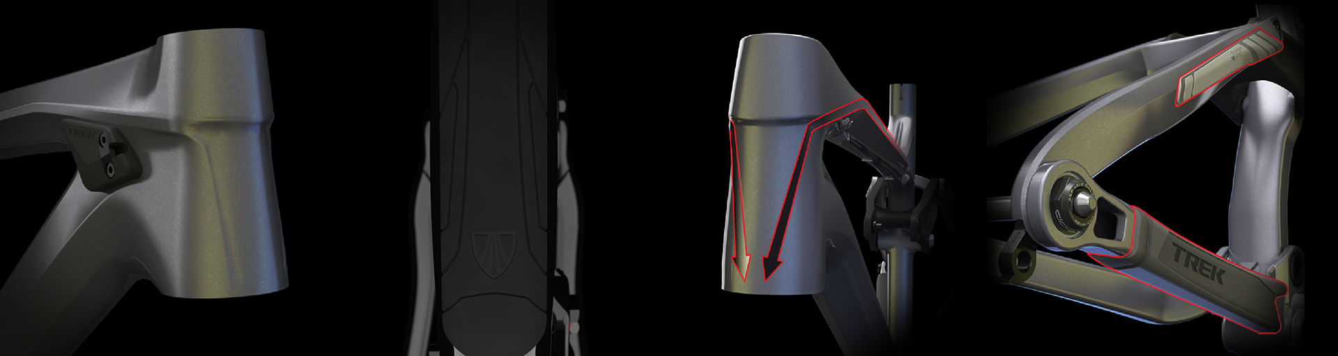
From language from the Race/Rush sculptures applied to the frame
By 2012, I was repeating the exercise and evolving Trek's VBL and my own. Again, The most effective way to communicate visual brand language is through something tangible. It must go beyond form and consider the whole user experience.
After that (as a team) find reference imagery that aligns well with your pillars, and then start concepting.
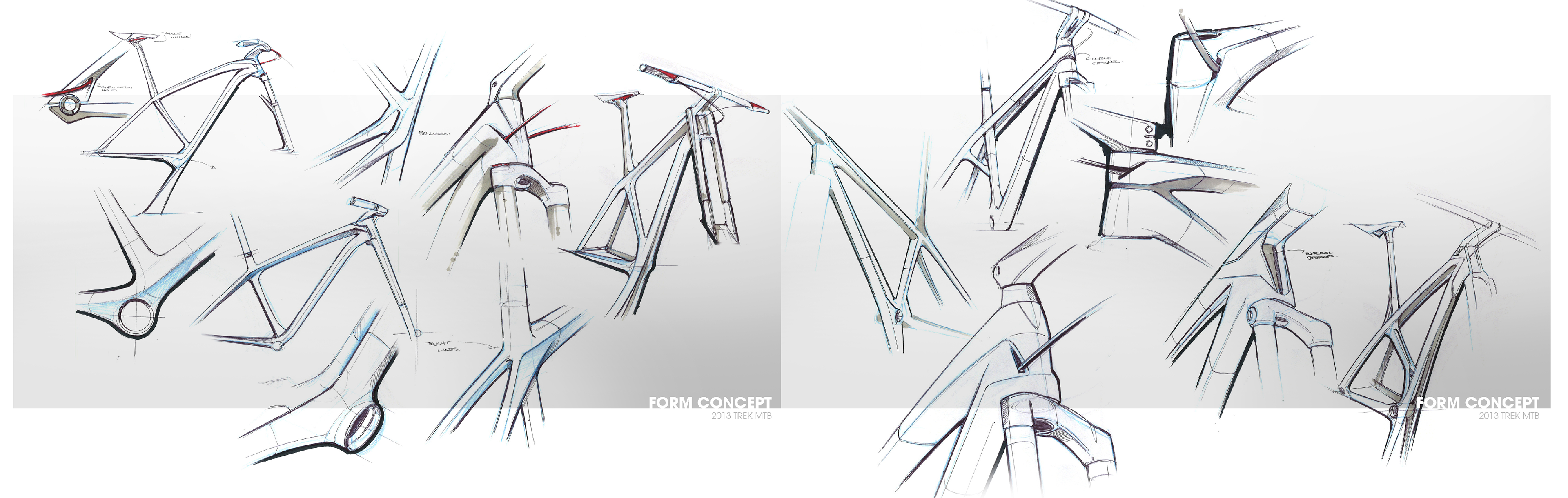
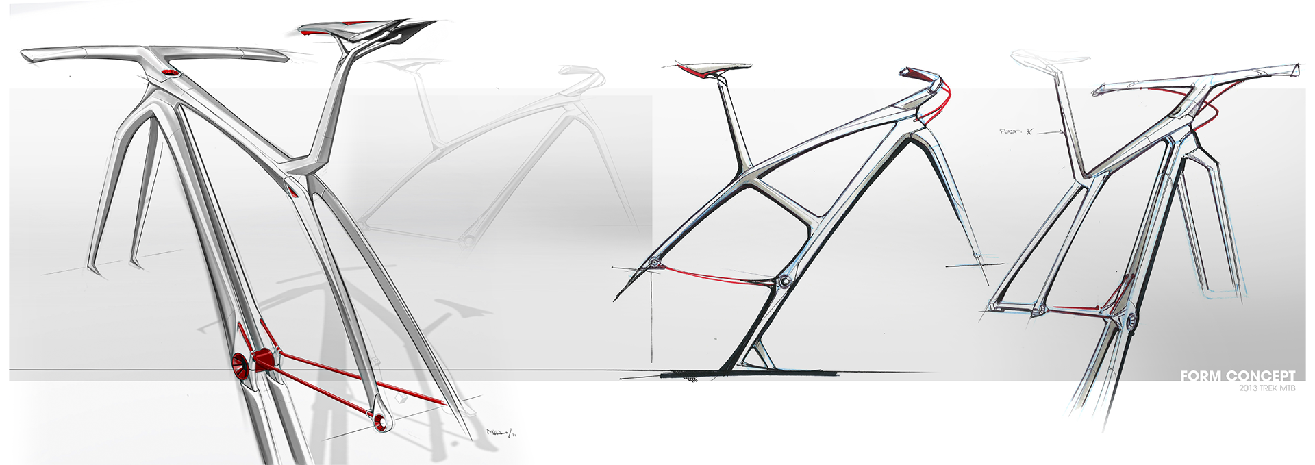
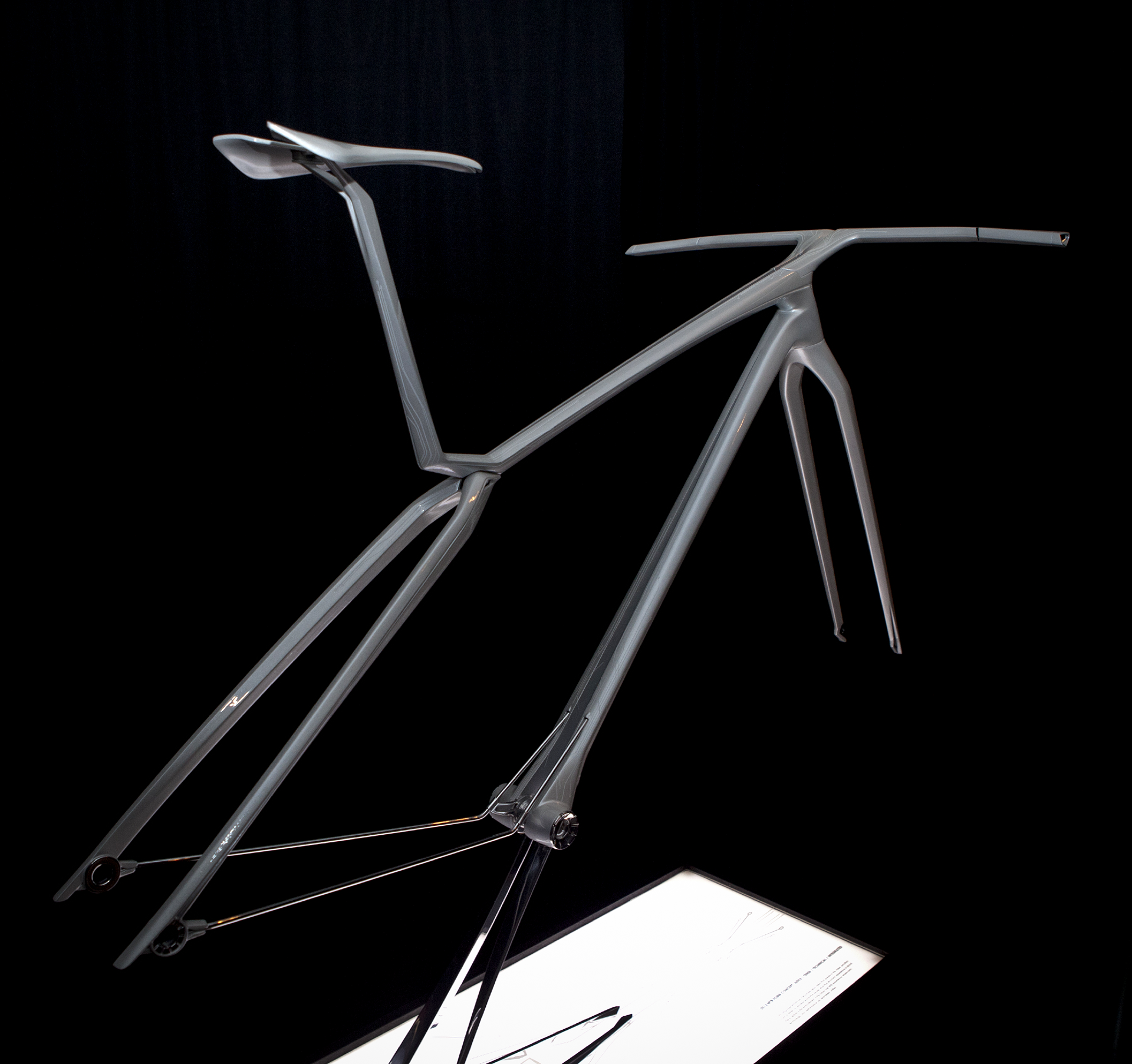
Sketch concepts. The final form needed to clearly represent a bike, but needed to be just abstract enough so that it wasn't taken as an actual frame design.
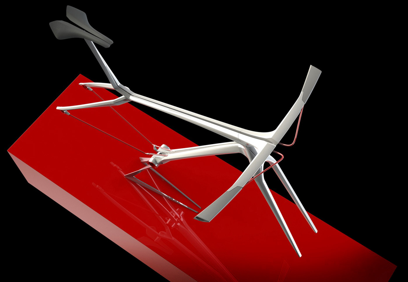
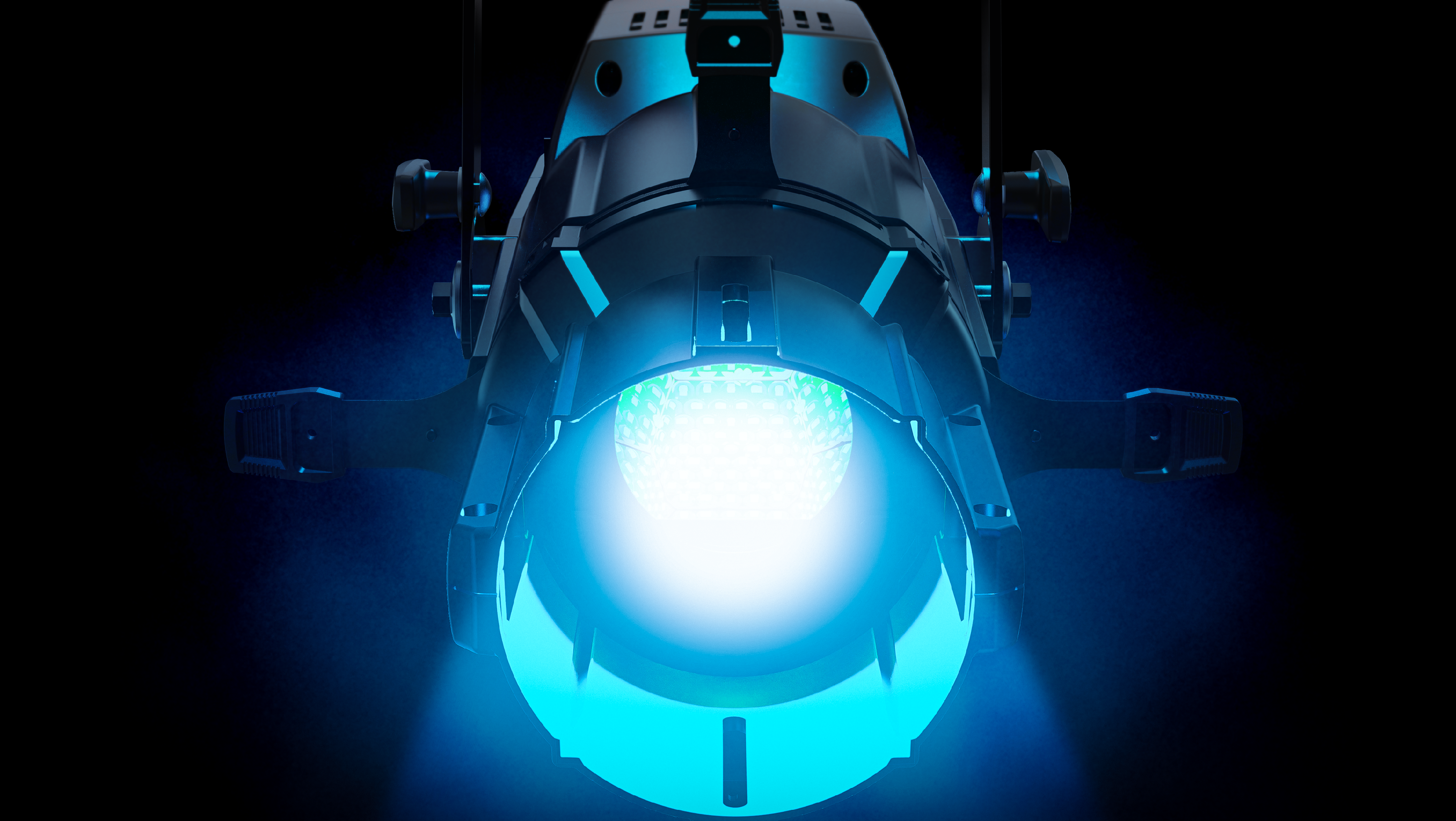
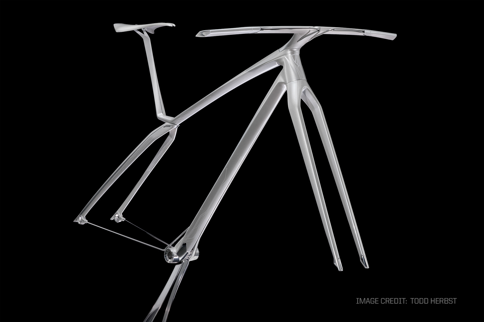
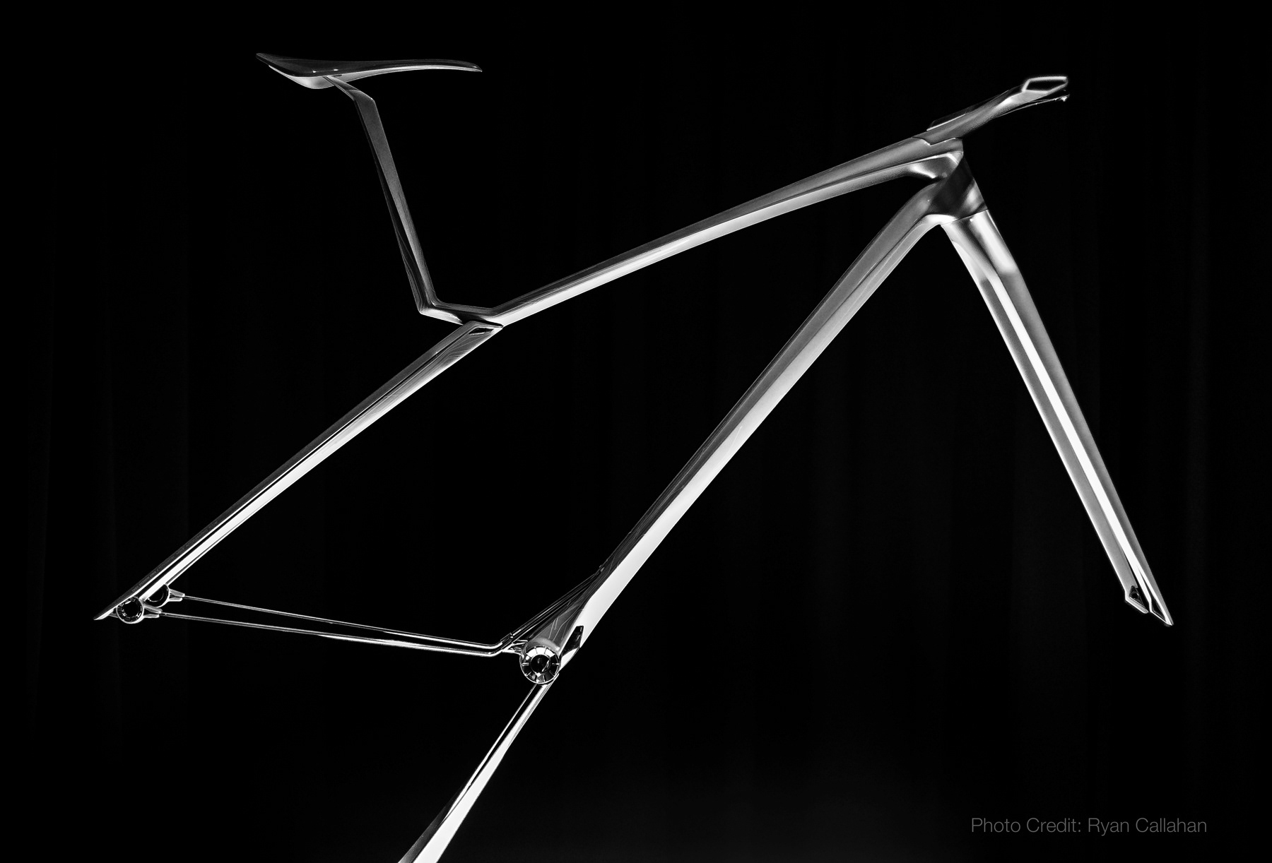
Nearly finished CAD Concept. This was completed in 2011 - this project was 'extra curricular' and took the next year to complete the physical model.
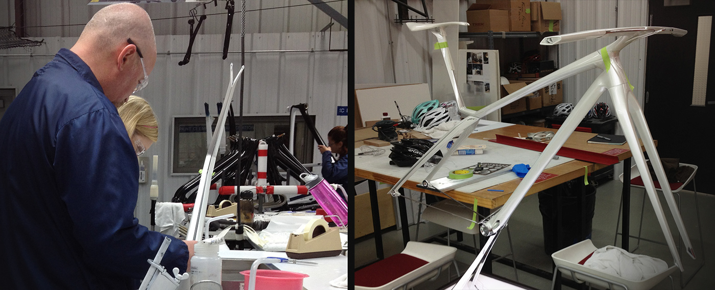
Making it real was a critical step in the learning and development process.
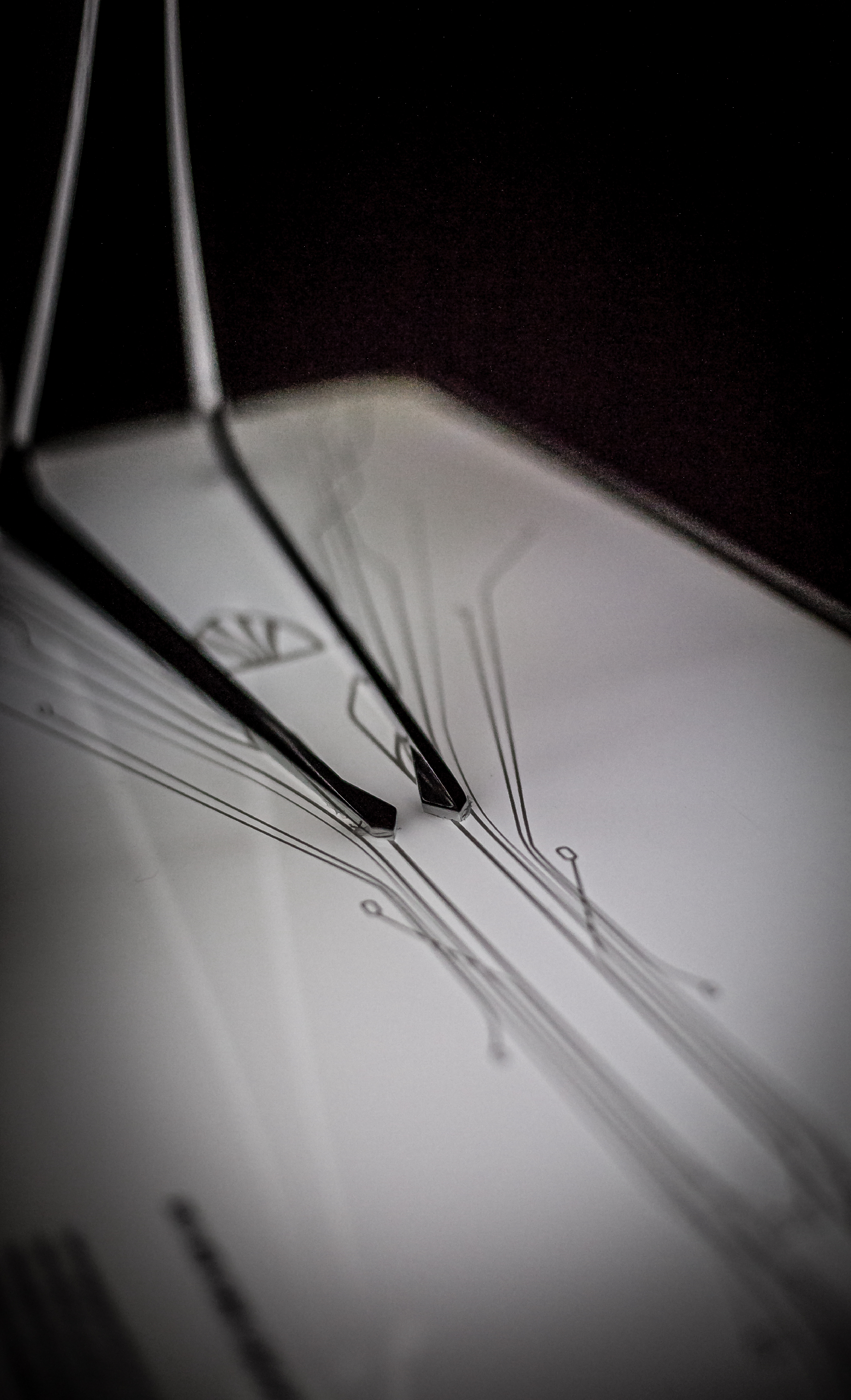
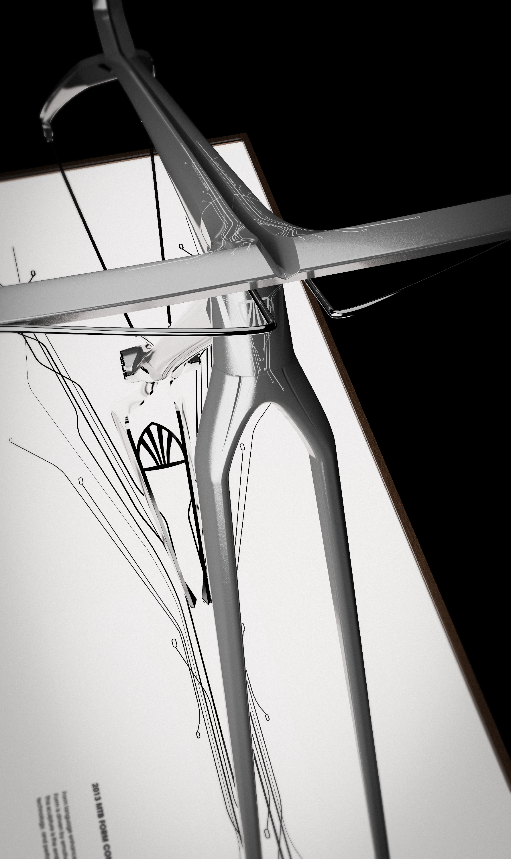
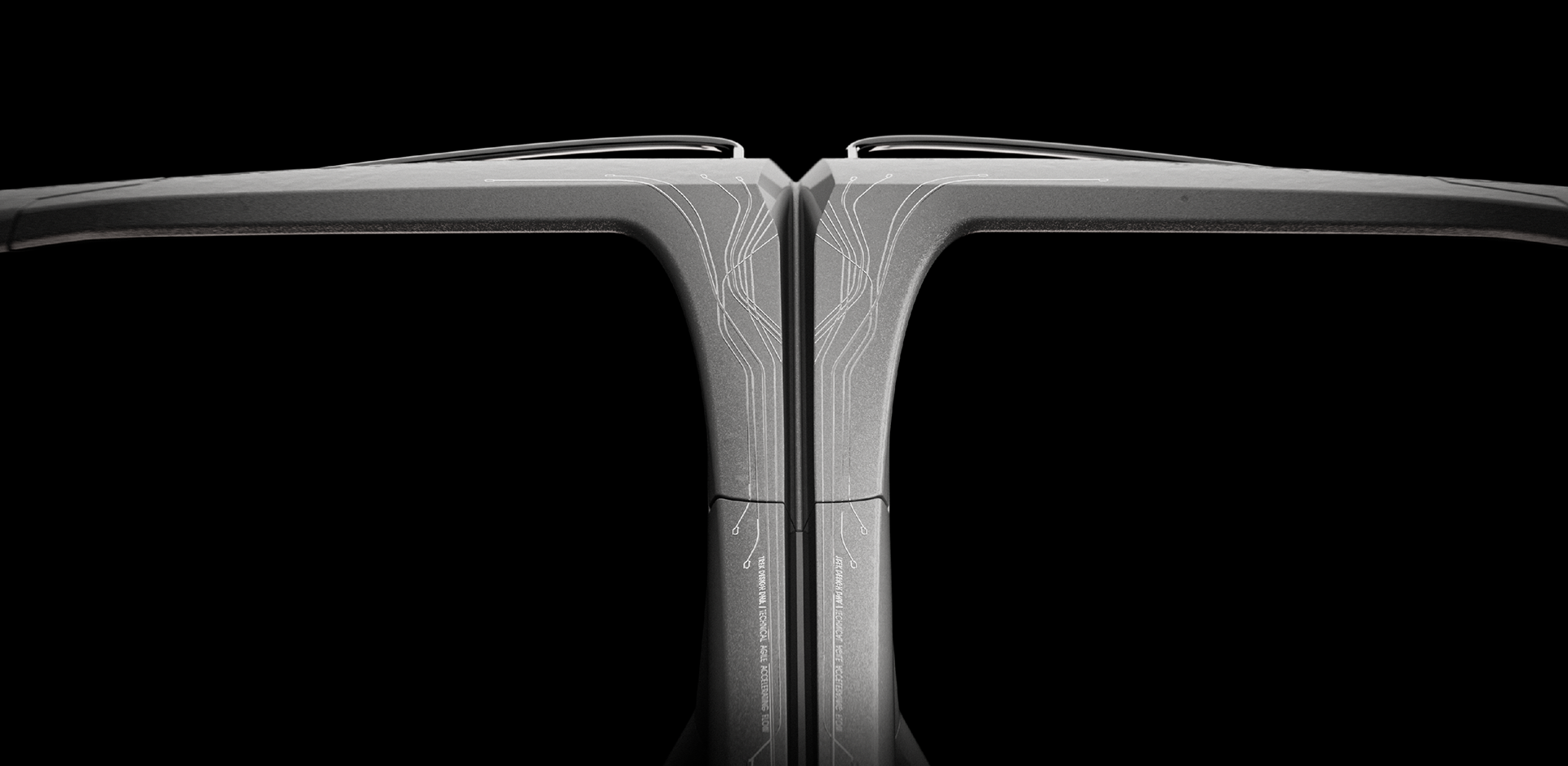
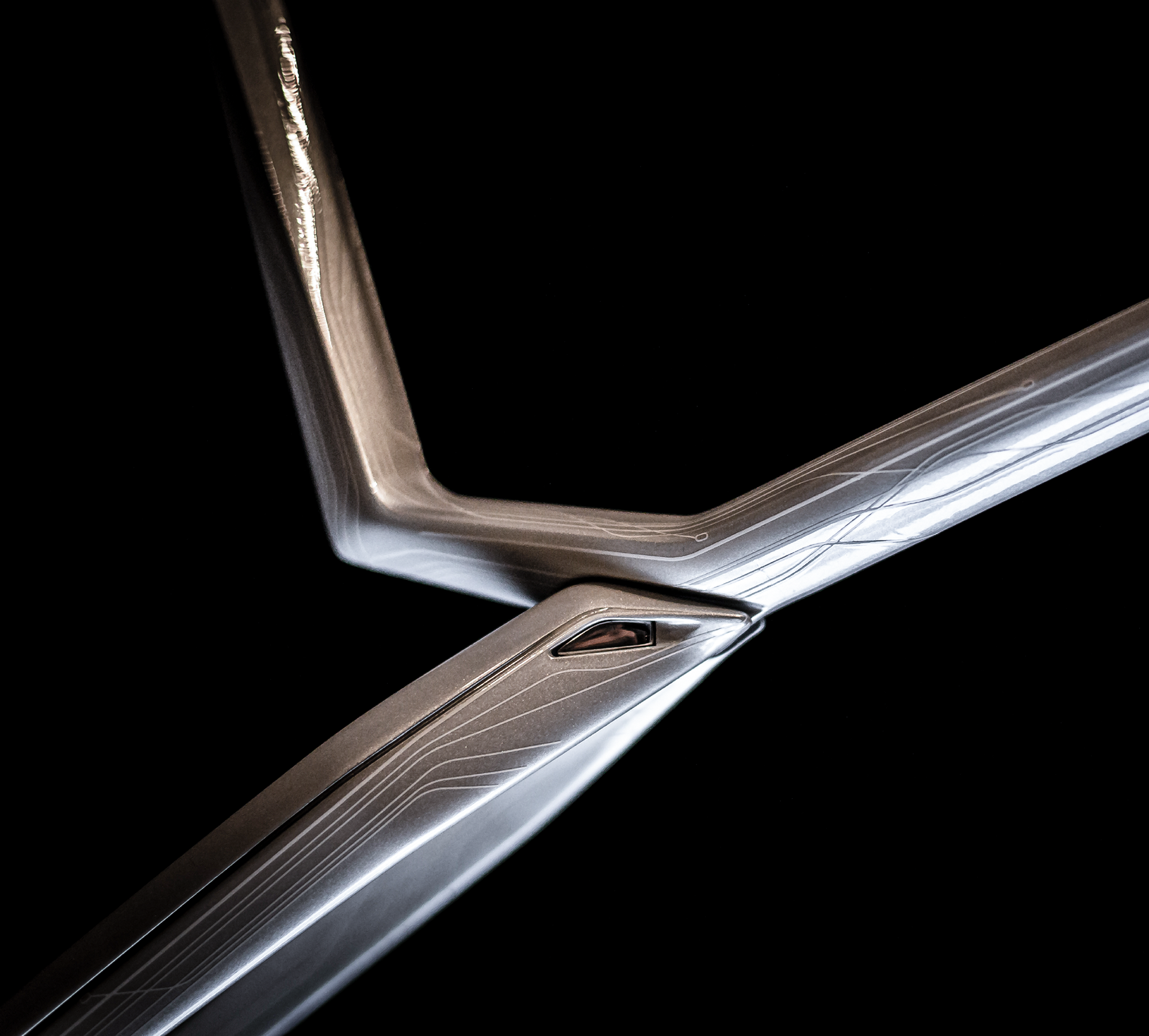
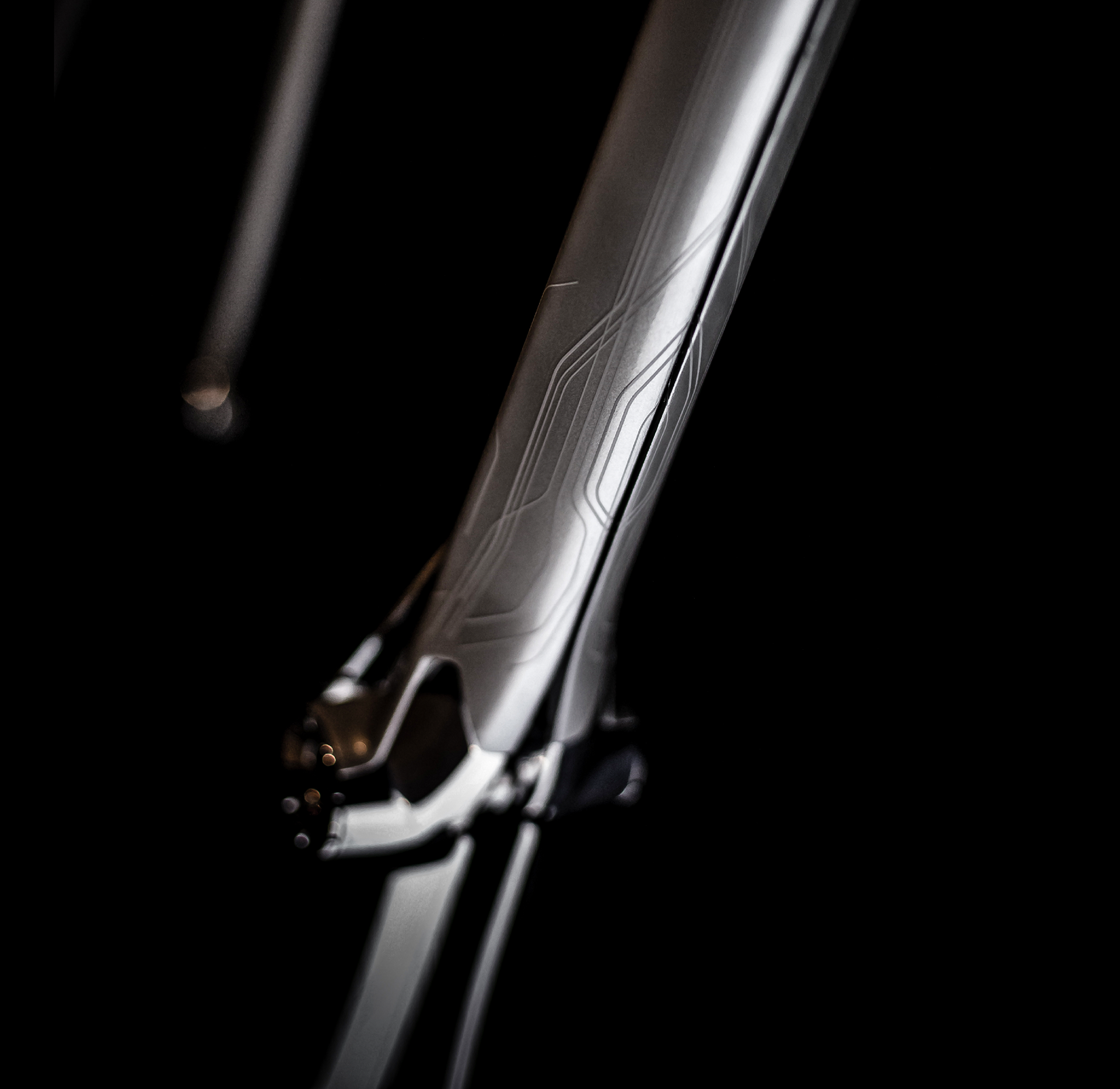
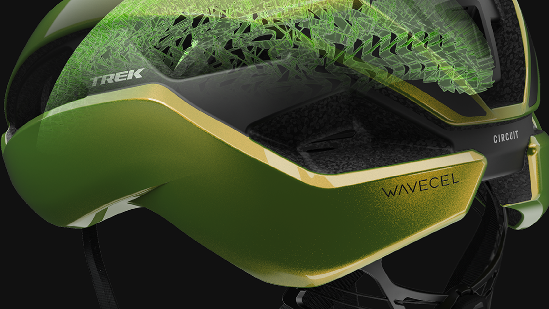
Graphics were critical in giving the sculpture texture: Beyond form we were pushing the theme of 'electronic integration' - the concept therein had to communicate this.
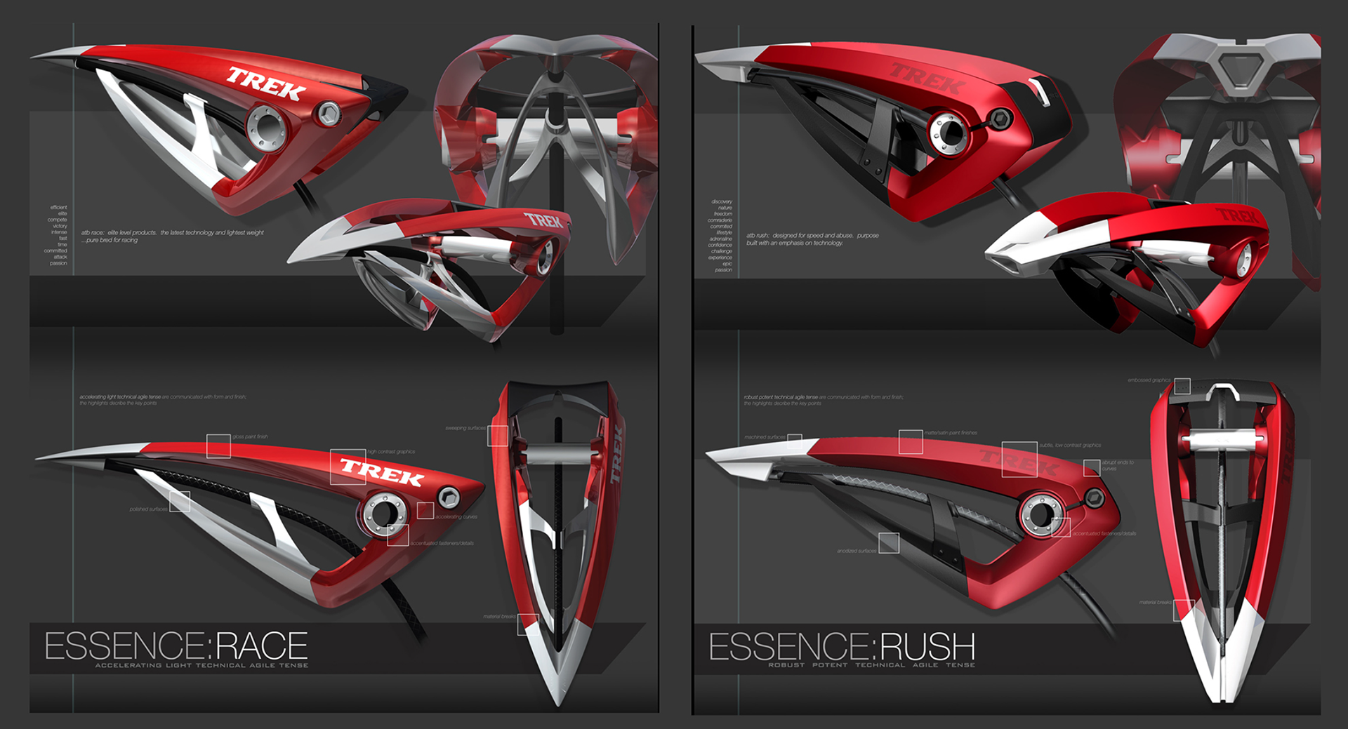
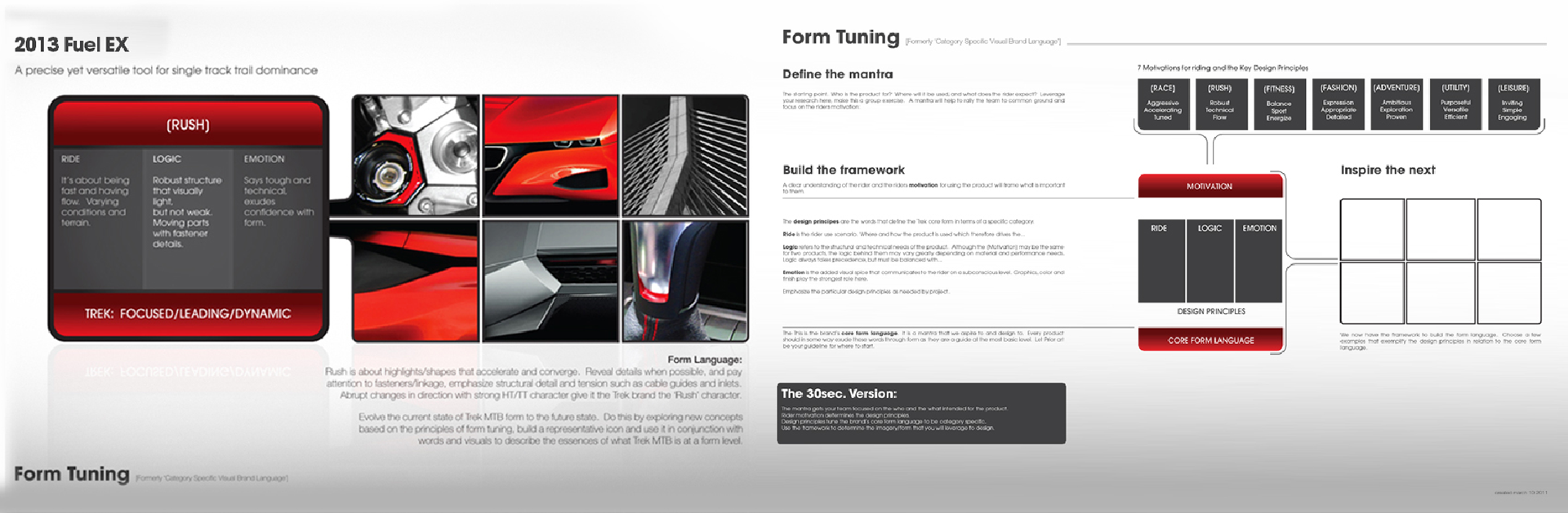
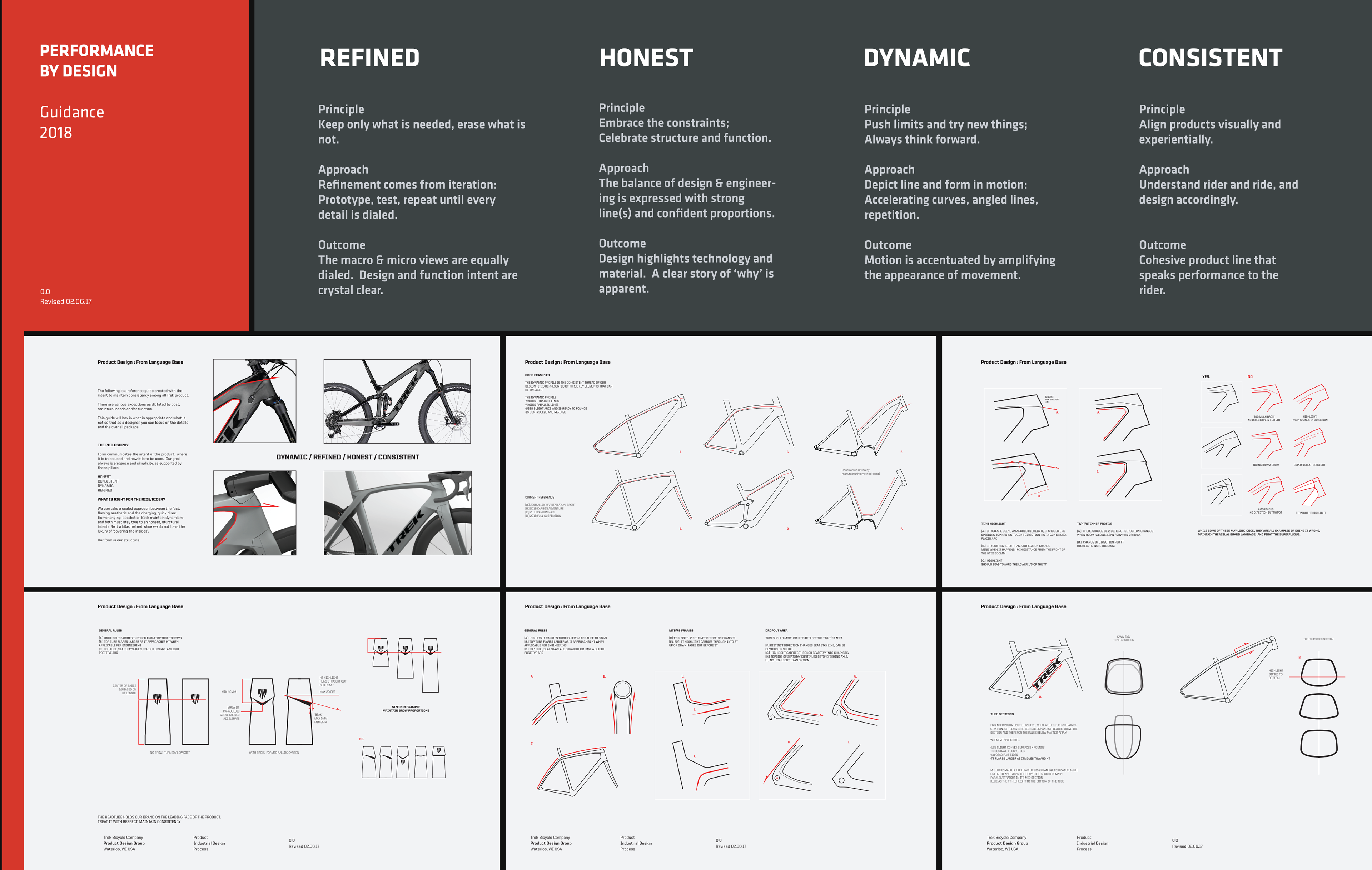
The journey continued as shown in the following images. The philosophy evolved into consumer-specific VBL. It focused on giving the designers a set of core principles, with the ability to tune them to their specific customer(s), It was also a great way to guide designers working on a new category - helping to keep them grounded in Trek's VBL while still meeting the needs of cost, manufacturing limitations.
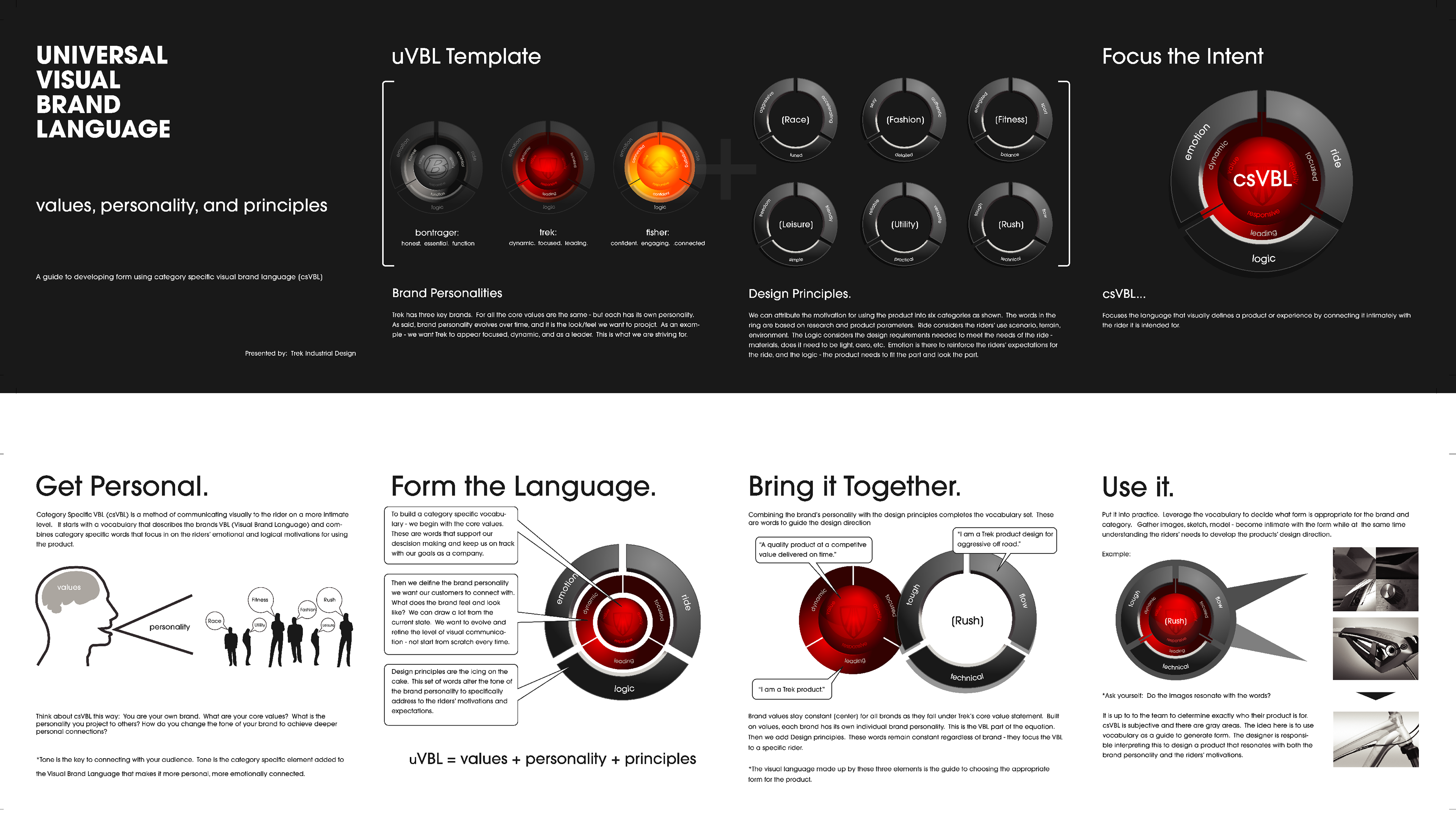
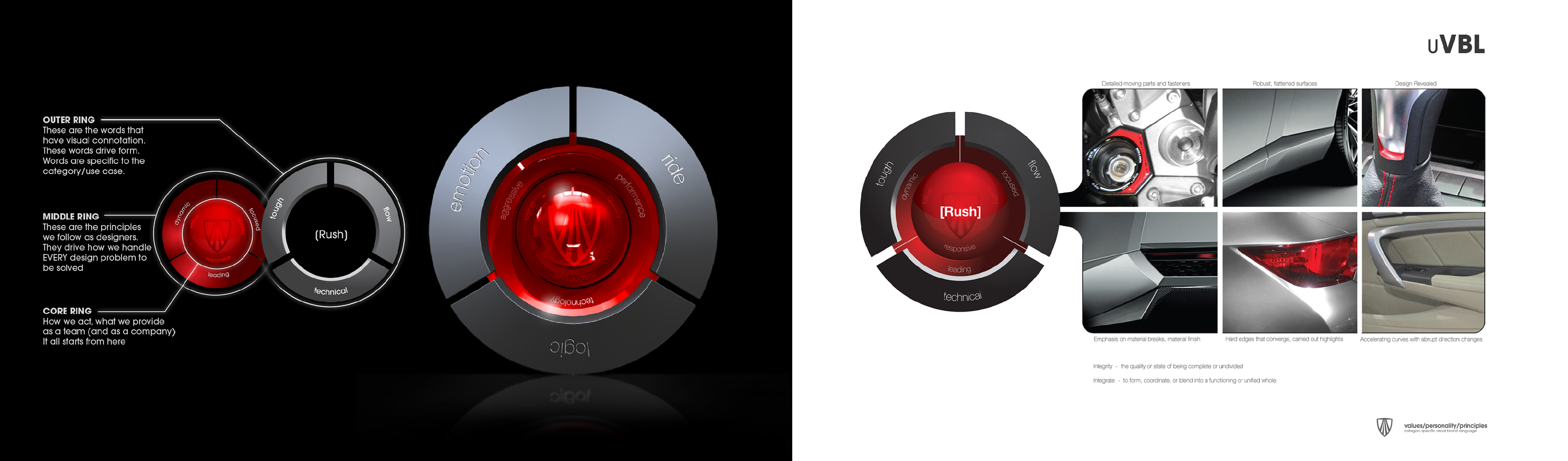
Application: Words translate into imagery, imagery translates into form.
First define your target; What do you want the language to emote to the rider?