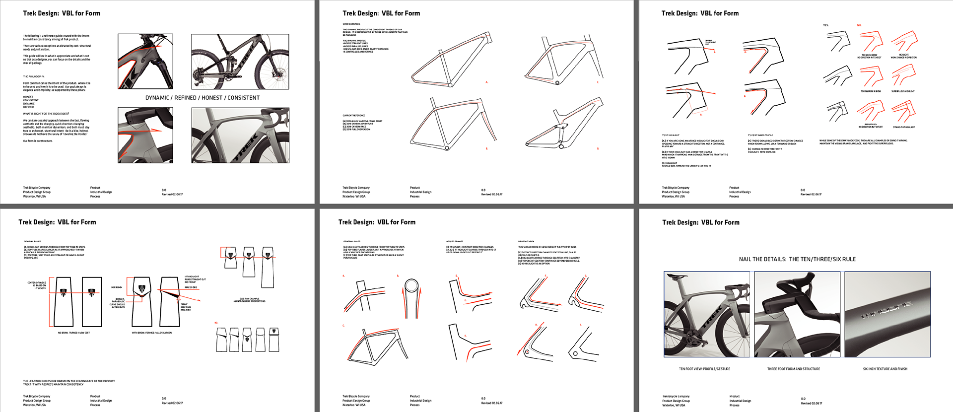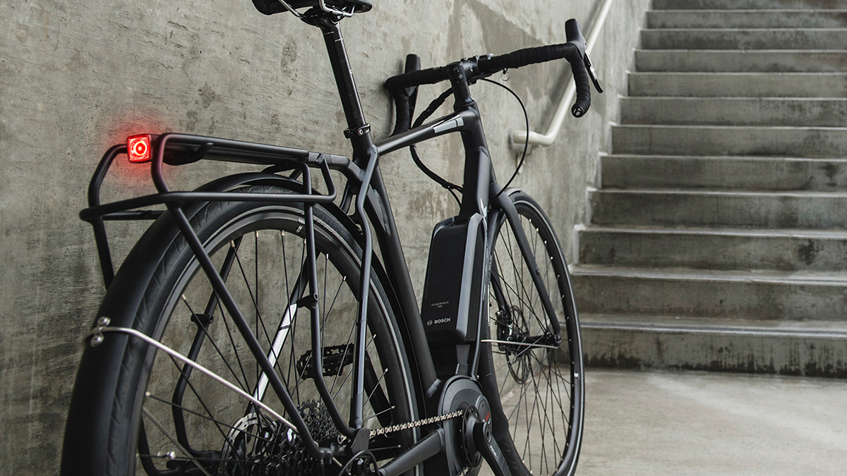
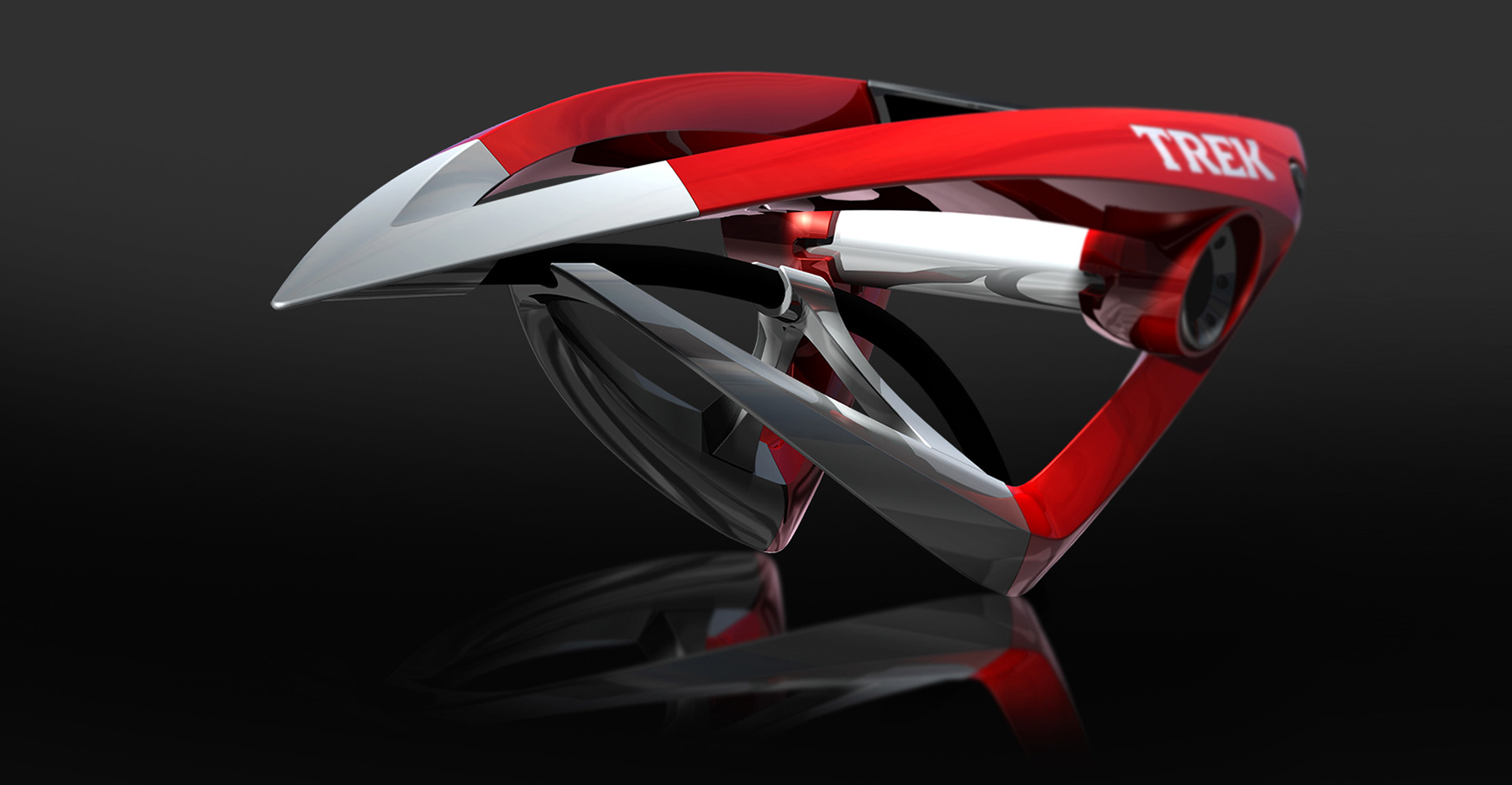
Visual brand language was an early focus of my career. In 2007, I set out to rethink how our design group defined, documented, and evolved Trek’s form language as a repeatable system rather than a series of one-off products. The images that follow illustrate an early form-development framework that unified Trek’s product family under a single, cohesive design vision while still allowing for category-specific expression.
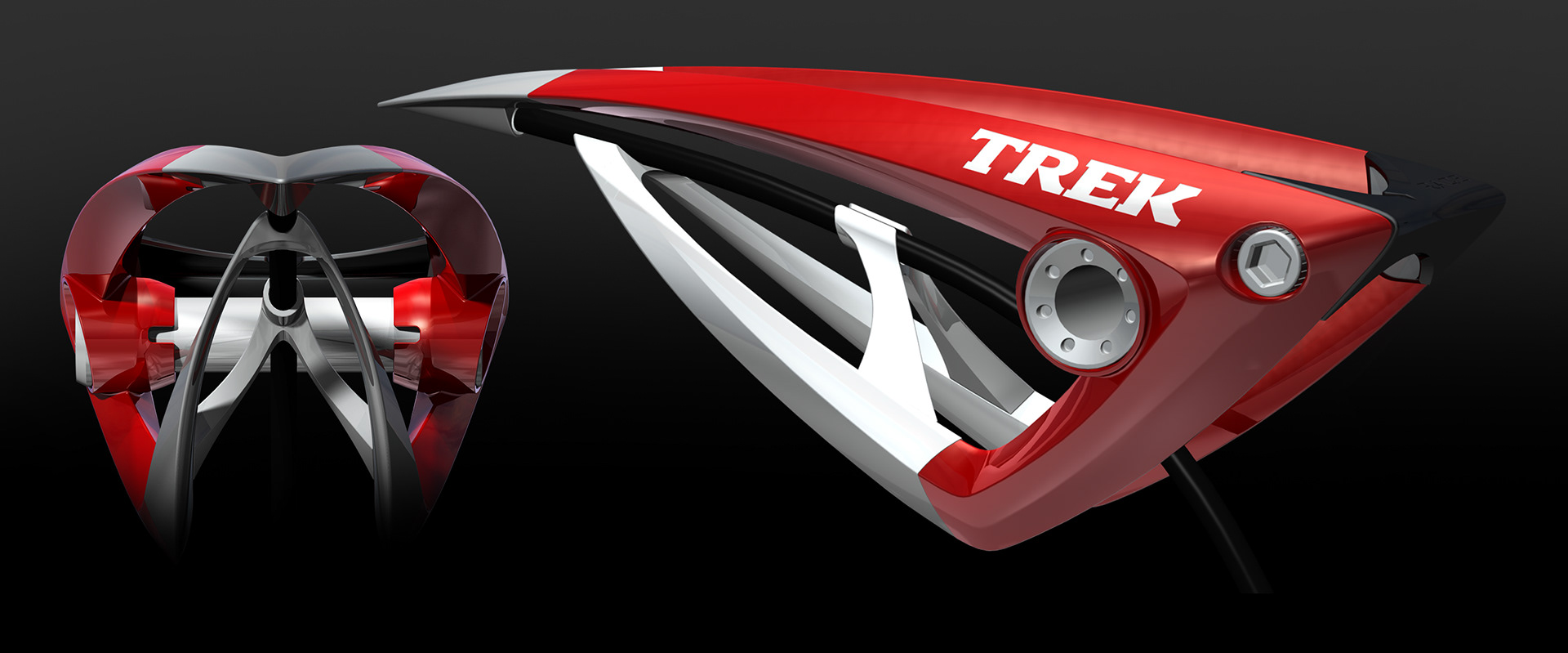
The renderings shown are original outputs from SolidWorks PhotoView—created nearly 20 years ago—representing some of my earliest work exploring scalable, system-driven design thinking.
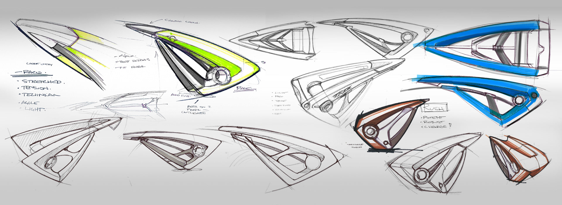
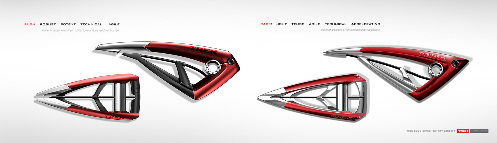
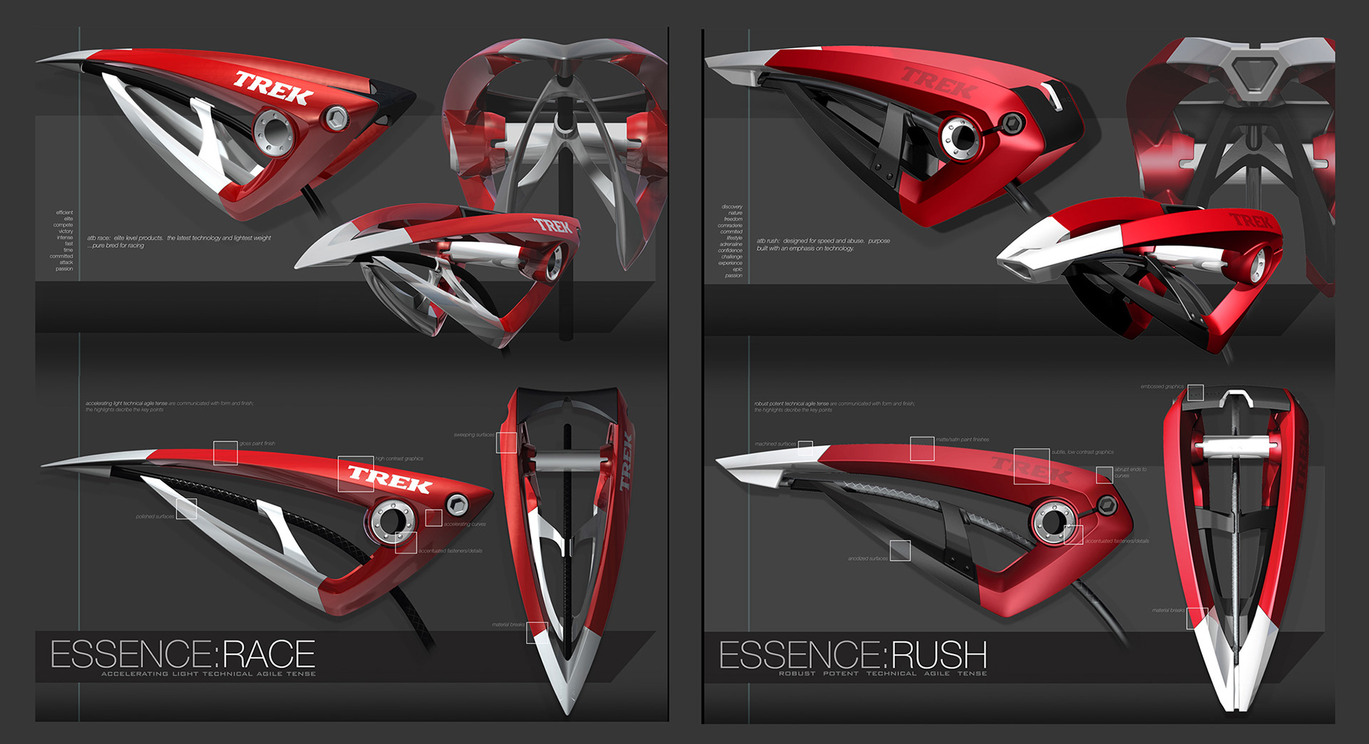
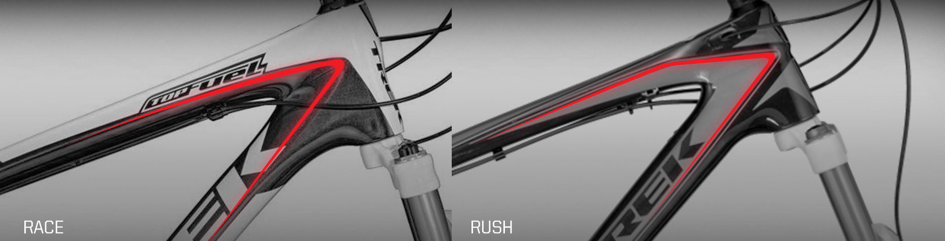
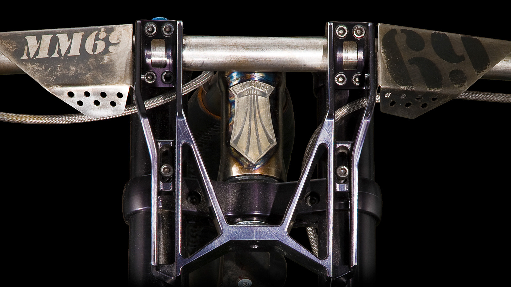
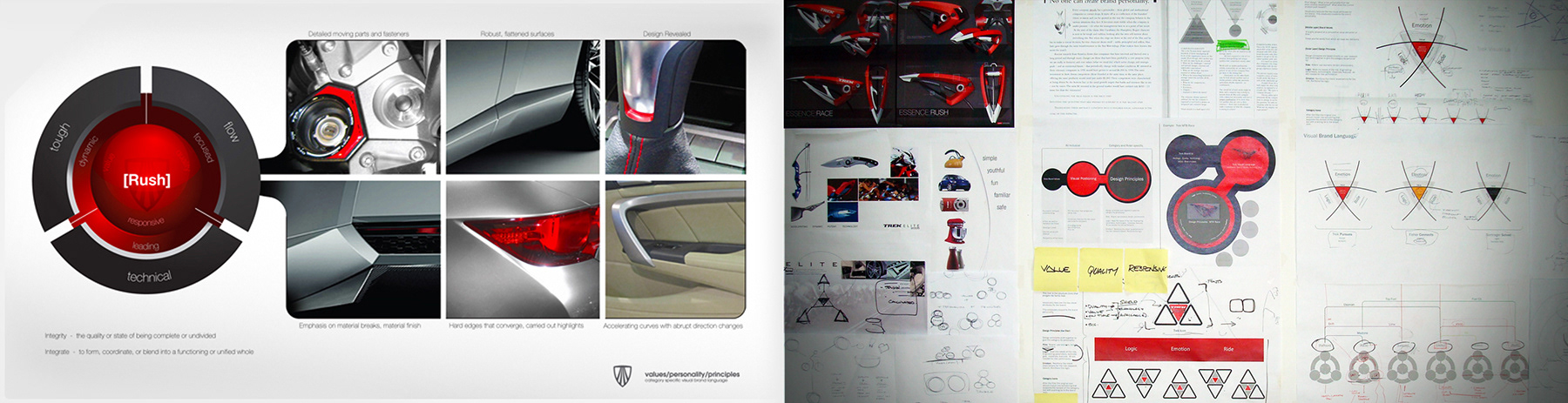
he VBL concept started with a set words. Words that resonated with specific riders. It was evident that we needed to tune VBL to more closely address customer desires; Mountain bikes are not just mountain bikes. There are key categories represented by a multitude of riders that each have specific functional needs from their products. Words that worked visually were sketched, sketches were modeled into sculptures that represented products for two distinct riders - the racer and the person out for the rush.
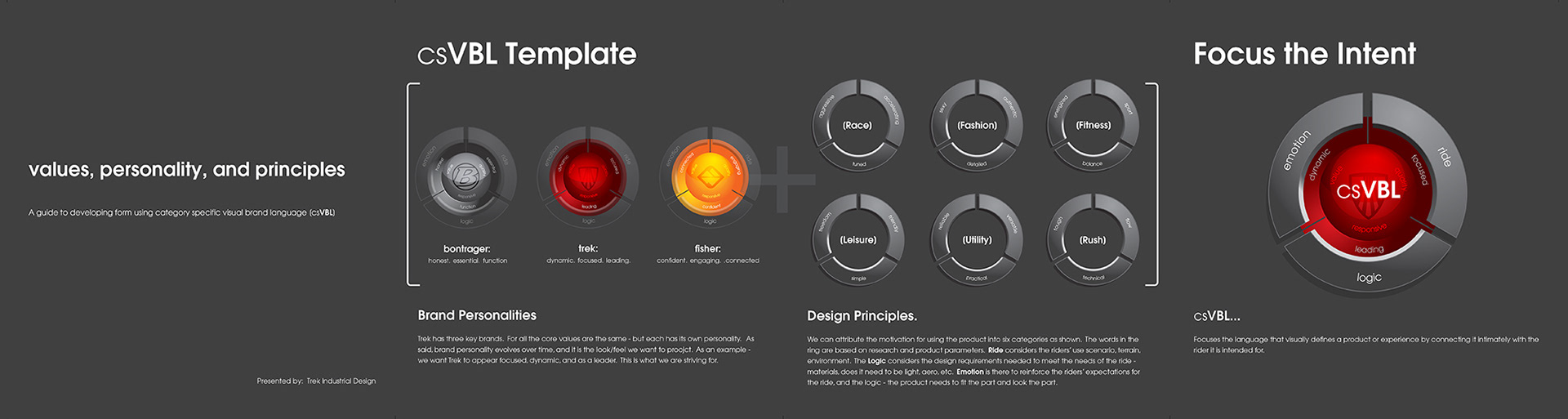
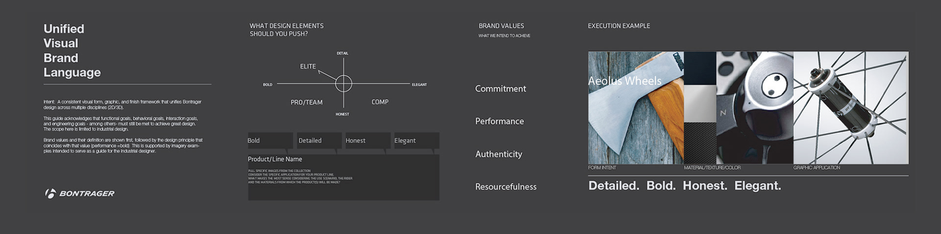
The methodology proved effective for mountain bike development - but what about other categories? I had to look deeper - I had to create a tool that allowed everyone on the team how to take their understanding of riders' needs and communicate it through form. Category-specific visual brand language was born (csVBL).
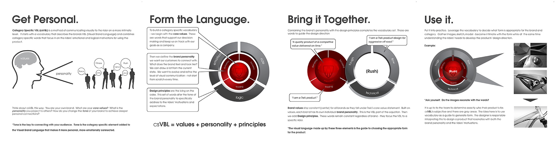
Understanding the rider (end user) gives context to the designer. And whether they - the rider - realizes it or not, the product needs to speak to them in their language...what the spandex-wearing racer hears is different than what the gap-jumping thrill seeker hears.
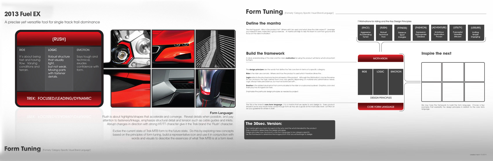
The process evolves to meet new needs and new definitions. The process is in summary: Understand your brands core design values and personality - combine that with end-user research (context, empathy) and engineering principles to communicate intent and emotion. That's it - an amazing process that a designer can use to achieve empathy for the user whilst maintaining the brand family look.
The last iterations of VBL documentation I worked on prior to leaving Trek